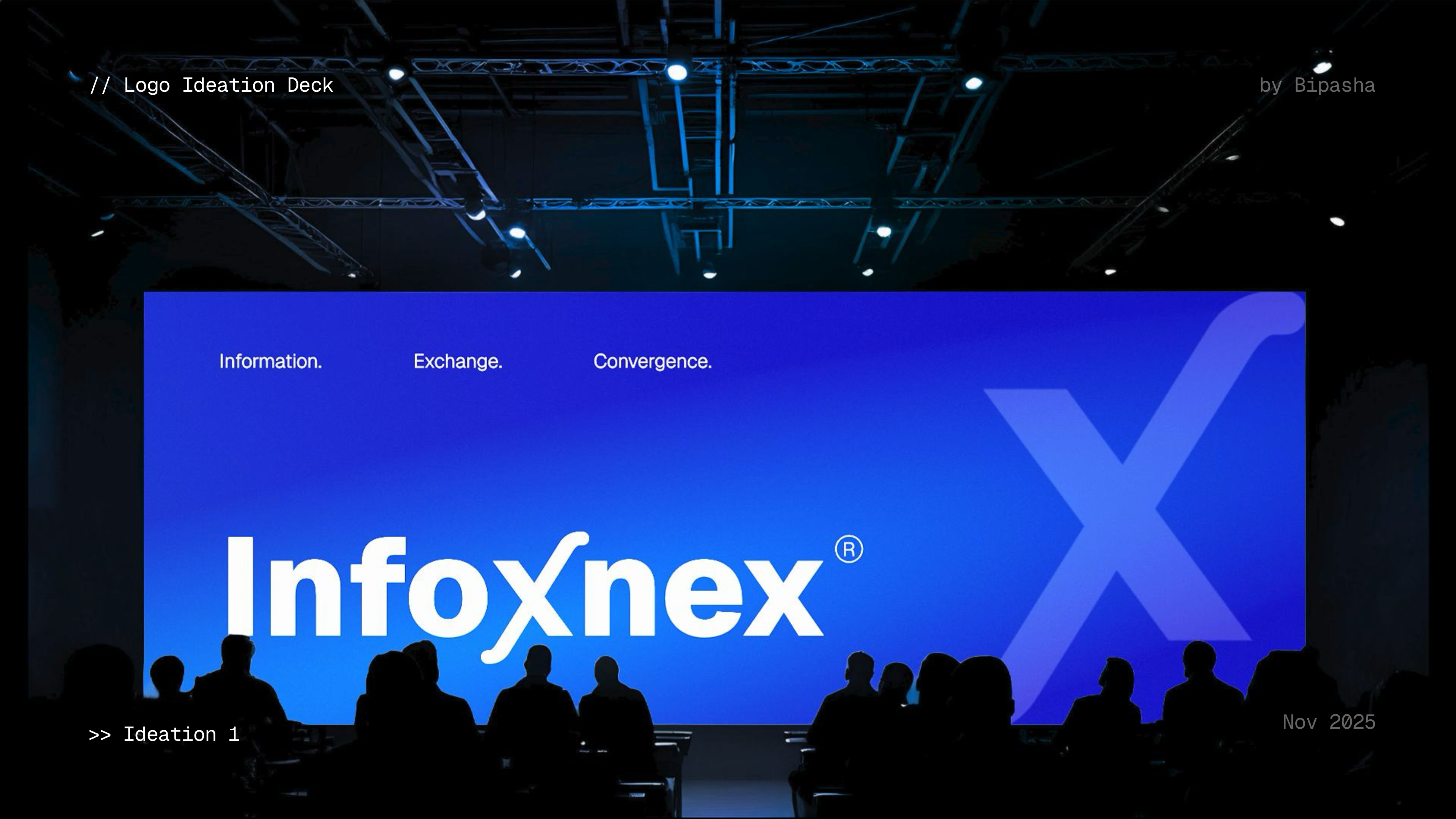
Information. Convergence. Exchange. Integration, made into a mark.
A compliance-driven enterprise IT company needed a name and mark that felt like a system, not a startup.
Infoxnex positions itself as your extended team, your transformation co-pilot, your innovation nexus, helping organizations protect, modernize, and optimize their IT landscapes with compliance at the core.
The task was a naming and logo ideation: find a name that encodes what the company does, then turn its hidden structure into a mark that an enterprise audience would trust.
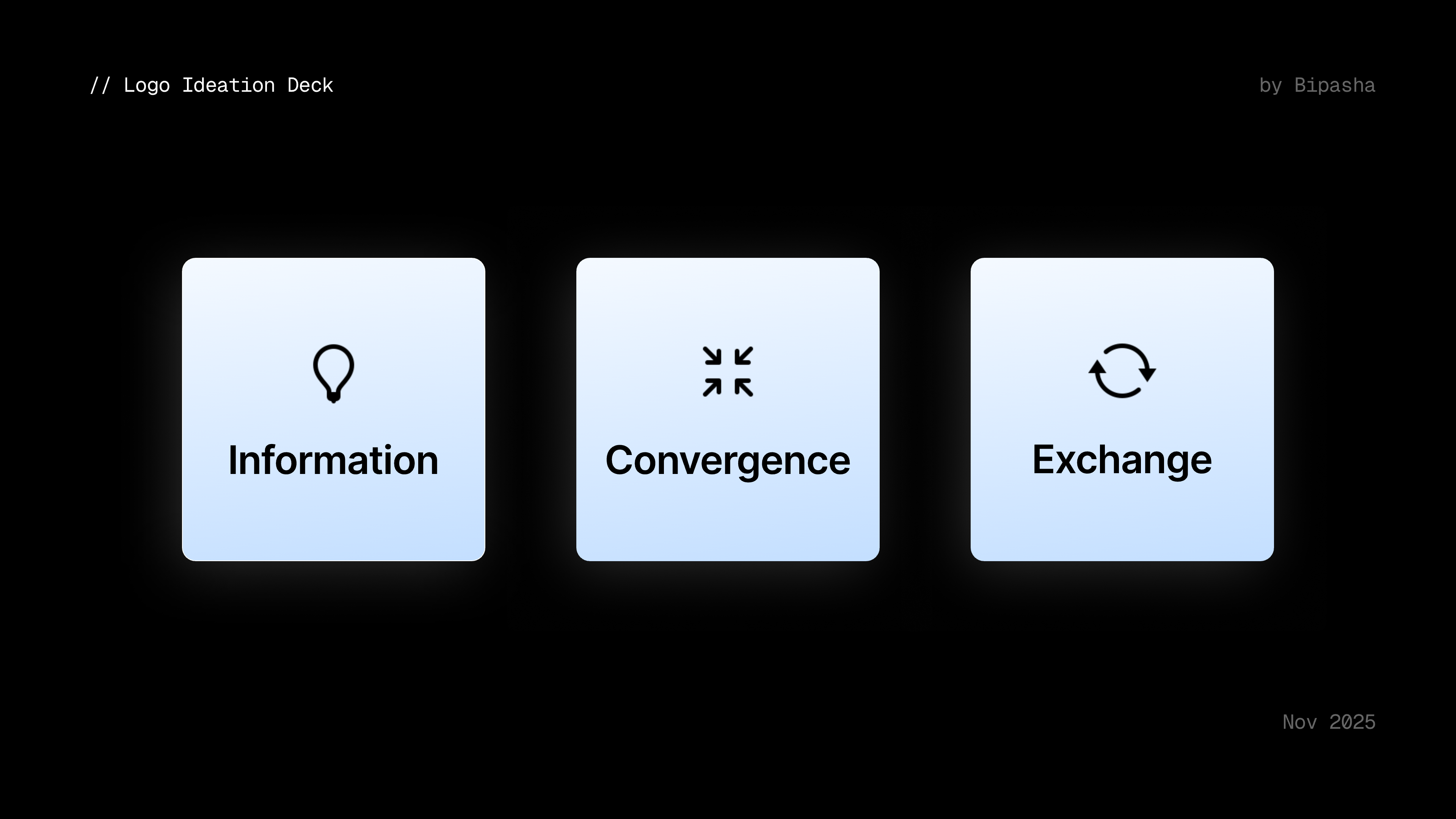
The name is built from three ideas the business runs on, and the “x” where they meet.
The raw material: data, systems, and the intelligence pulled from them.
Bringing fragmented IT landscapes together into one coherent whole.
Secure, compliant movement of information between people and platforms.
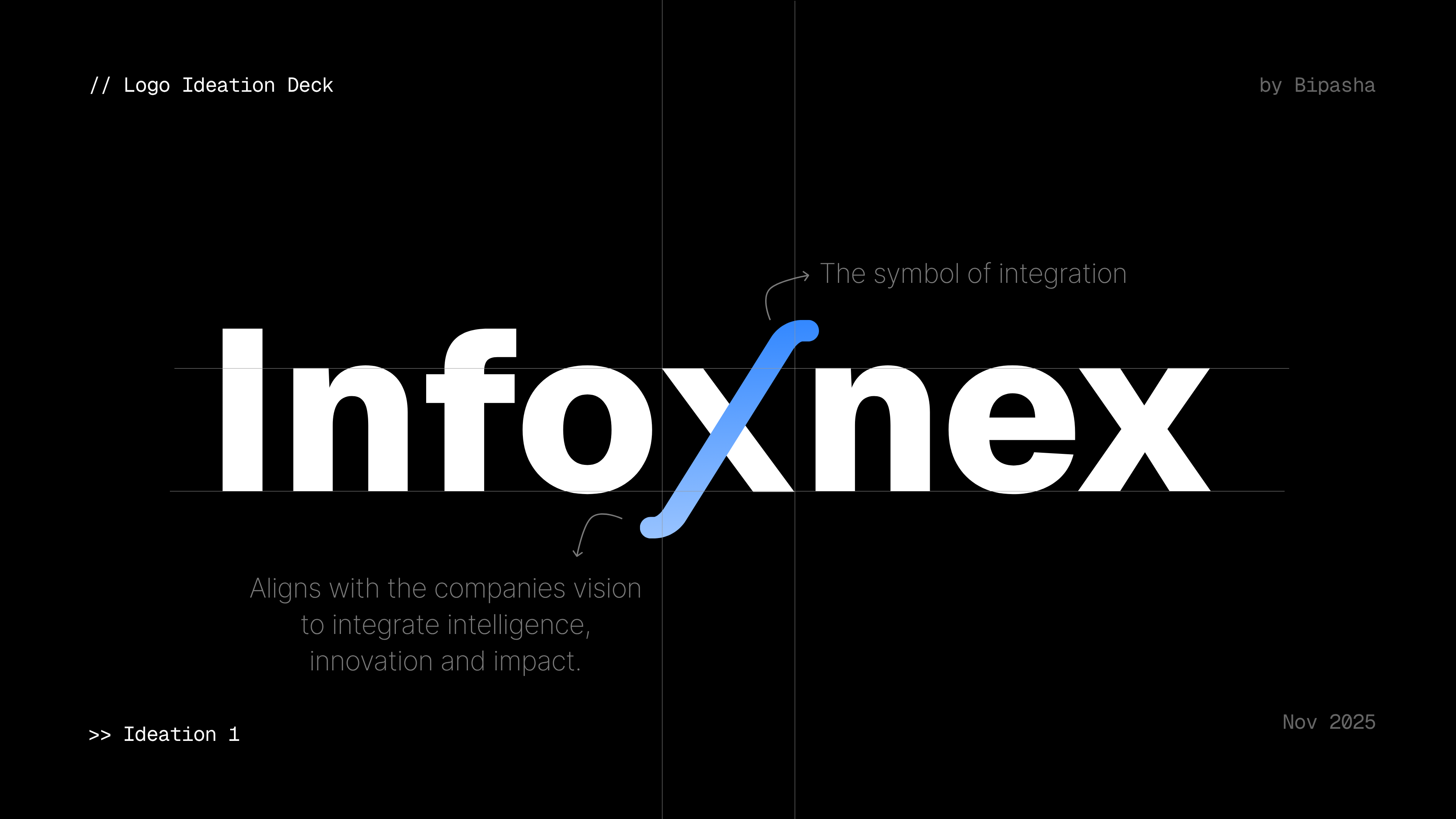
The hinge of the whole identity is the “x” sitting in the middle of the wordmark. Drawn in electric blue, it becomes the symbol of integration, the point where information, convergence, and exchange cross.
It aligns with the company's vision to integrate intelligence, innovation, and impact. One small letter does the heavy lifting: a single confident accent against an otherwise restrained, enterprise-ready wordmark.
Integration is the new innovation.
A confident dark base for an enterprise feel, with a single electric blue reserved almost entirely for the “x”, so the accent always means integration.
The mark tested across an app icon, ID badge, laptop, and building signage.
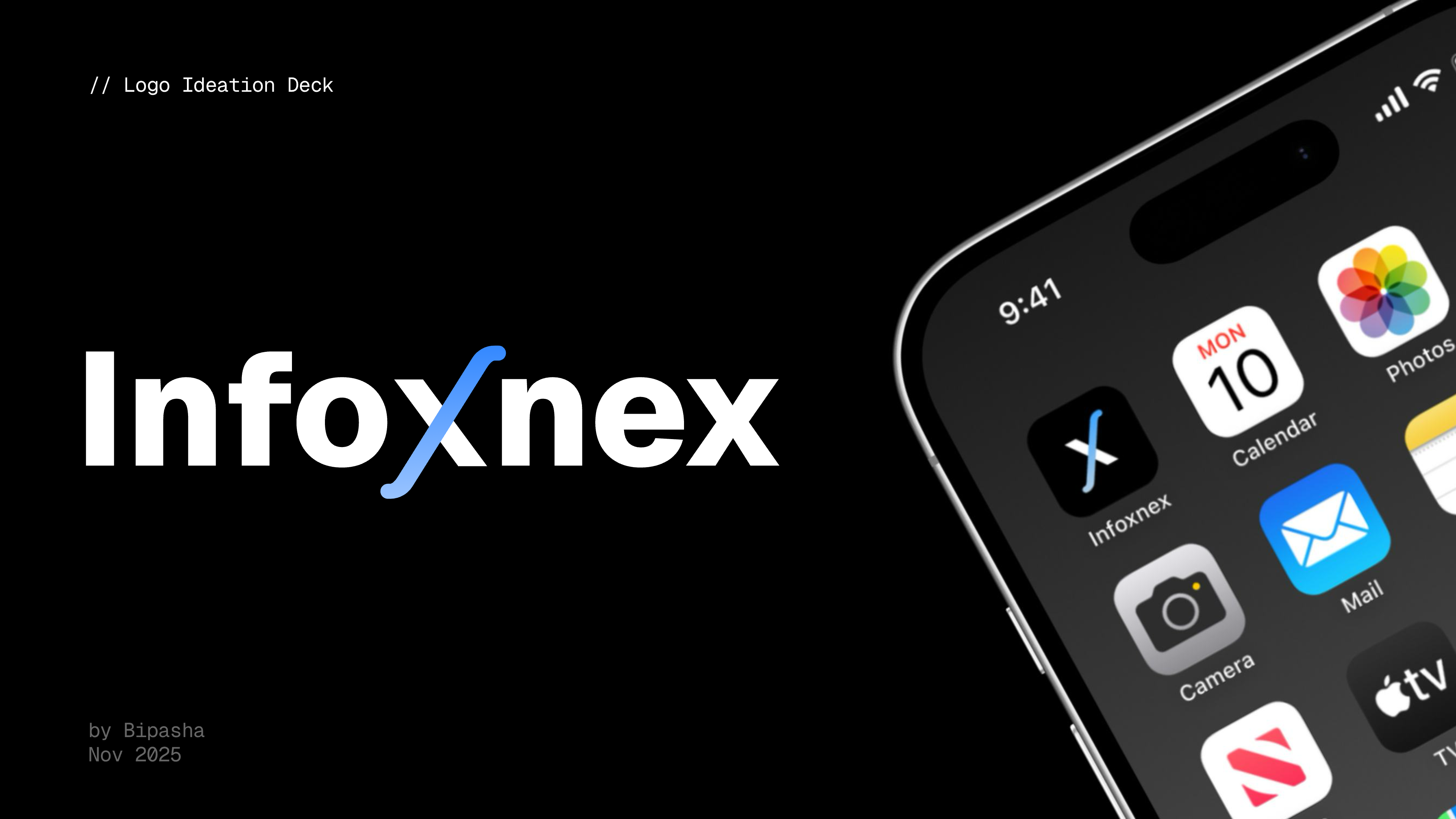
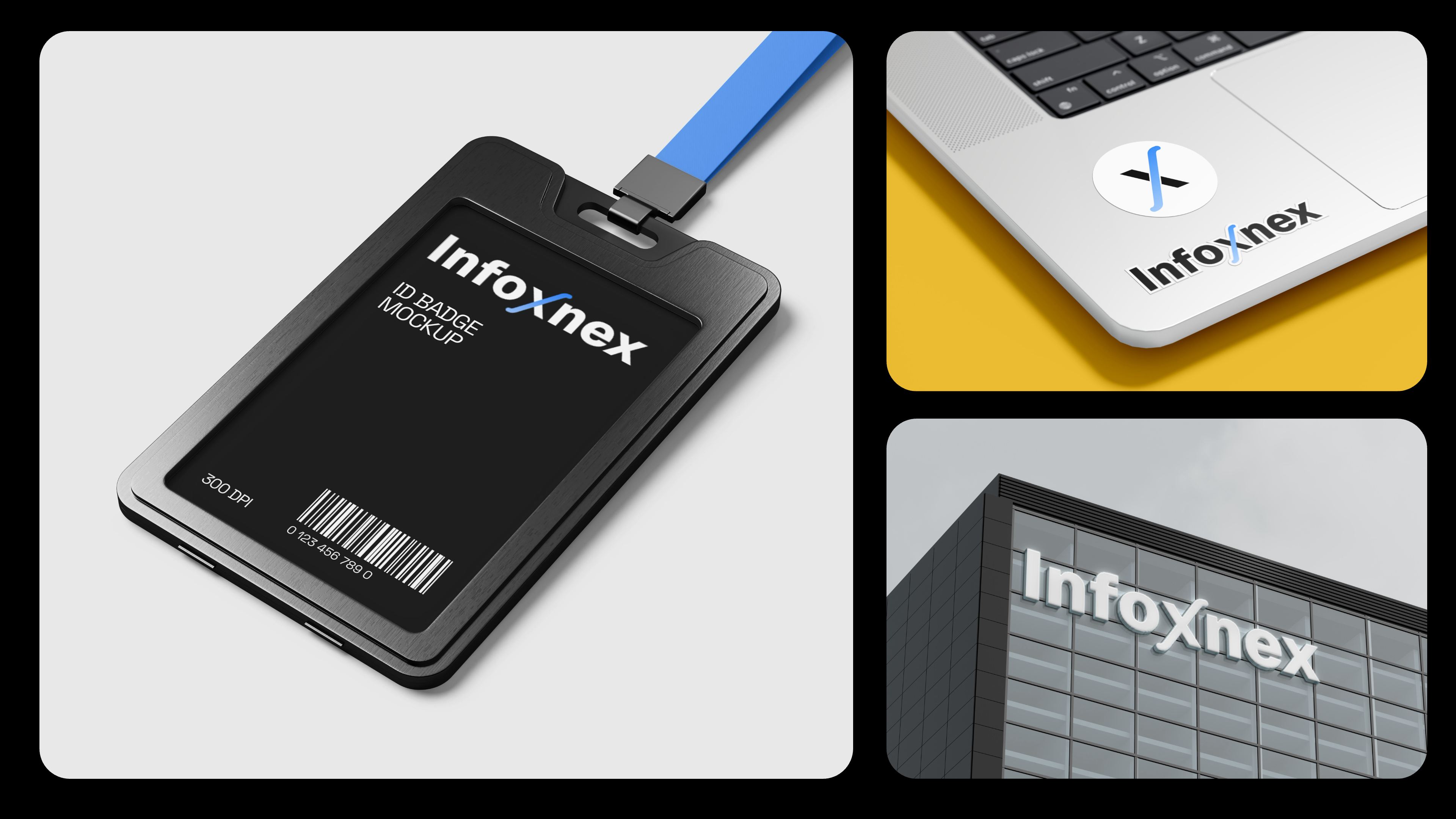
A coined name with meaning built in, and a wordmark whose single blue “x” carries the whole story of integration. Distinctive, enterprise-credible, and ready to scale across screen and signage.