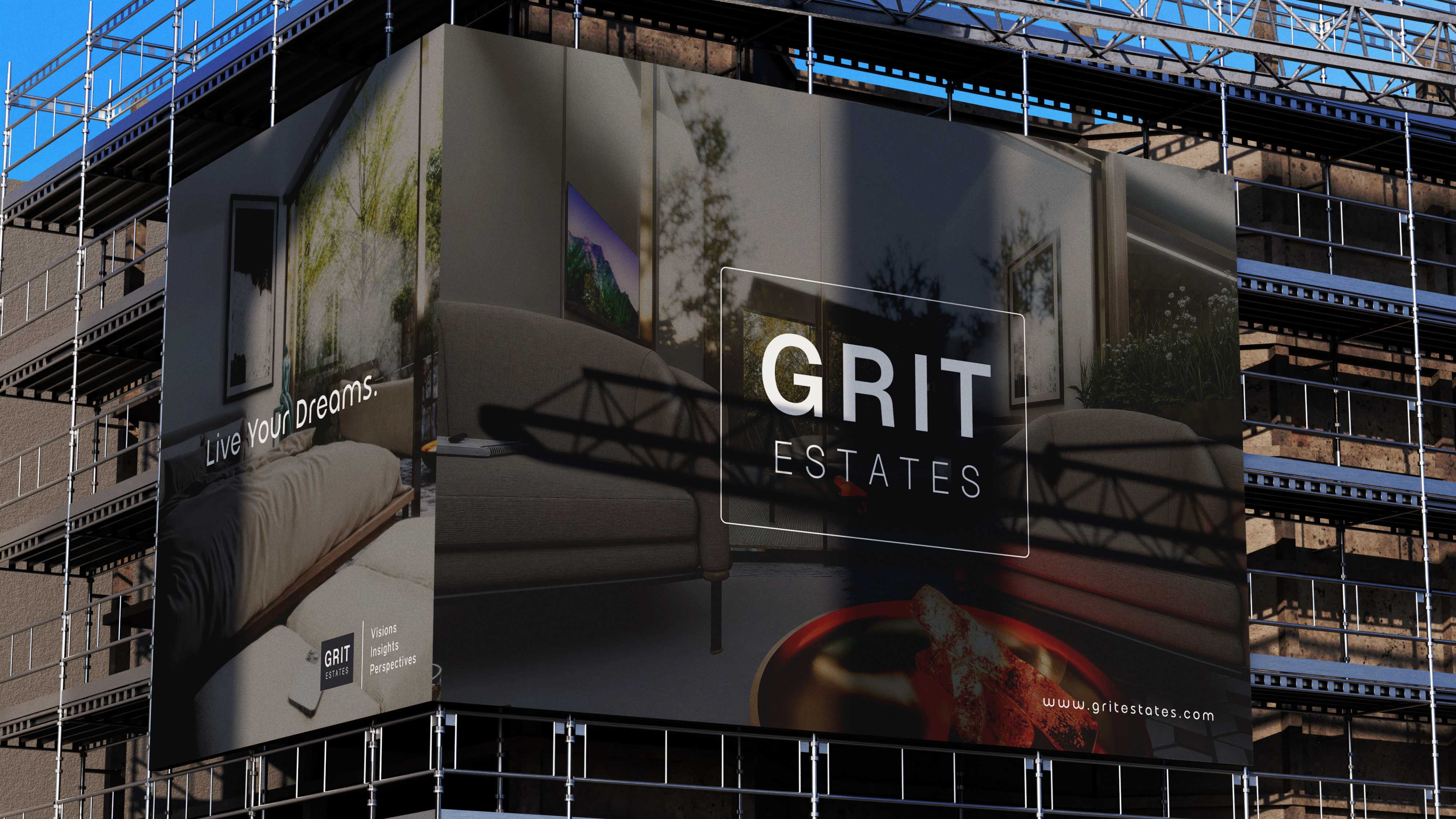
A real-estate identity built on permanence, where investment becomes home.
GritEstates doesn't build to flip. It acquires, rehabilitates, and holds, turning tired urban buildings into places worth living in.
The company needed an identity that signalled patience over speculation. Operating within established city contexts, GritEstates integrates existing architecture with contemporary standards, improving usability, longevity, and market relevance one building at a time.
My job was to make that philosophy legible: a mark, a full set of guidelines, and a website that all read as disciplined, durable, and quietly confident. Never flashy.
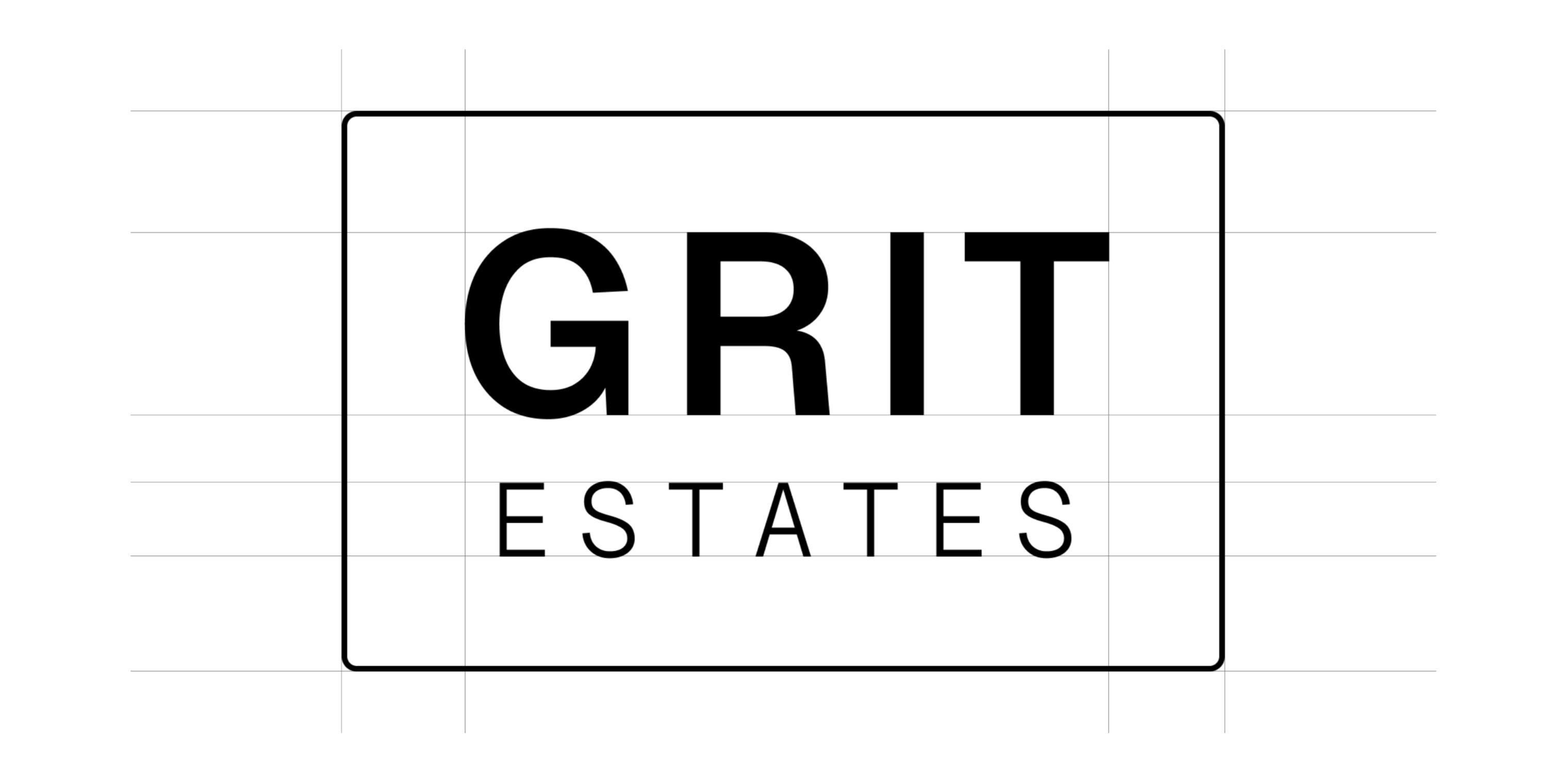
The logo is derived from the letter G. Its solid geometry expresses stability, discipline, and permanence, the core qualities of how the company approaches real estate.
A subtle upward movement inside the form reflects controlled value uplift: steady, deliberate growth rather than a quick spike. The mark is intentionally minimal so it survives at any size and across every material as the brand expands.
“Each project is an investment in place, balancing financial performance with spatial quality and durability.”
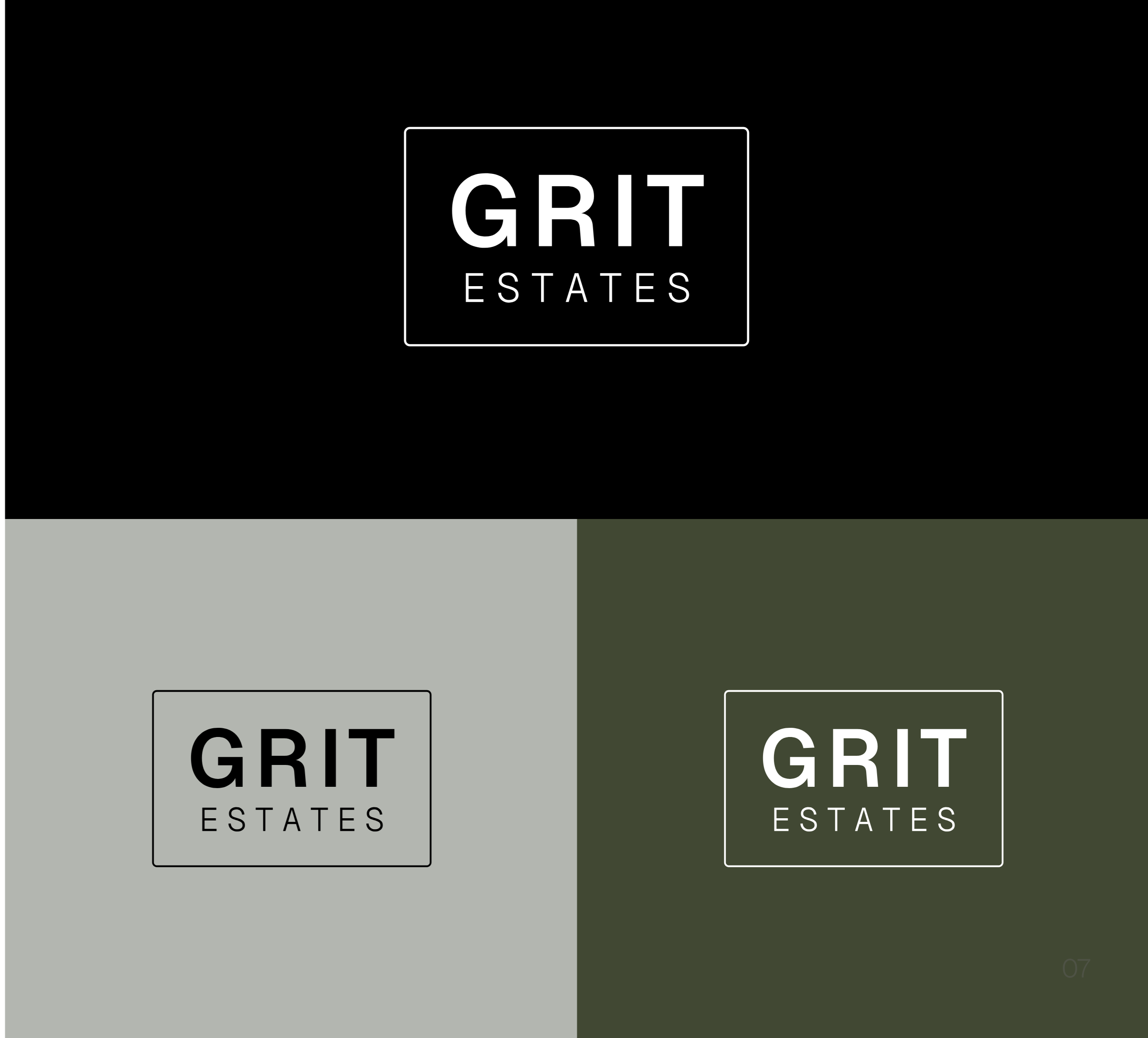
A near-monochrome core keeps the brand serious and architectural. A warm earth secondary palette of olive, coffee, and walnut adds the material warmth of the spaces themselves.
A single grotesque carries the whole system. Geist is structured and neutral: engineered, legible, and at home on a building site or a balance sheet.
The same restraint scales from a letterhead to a building wrap.
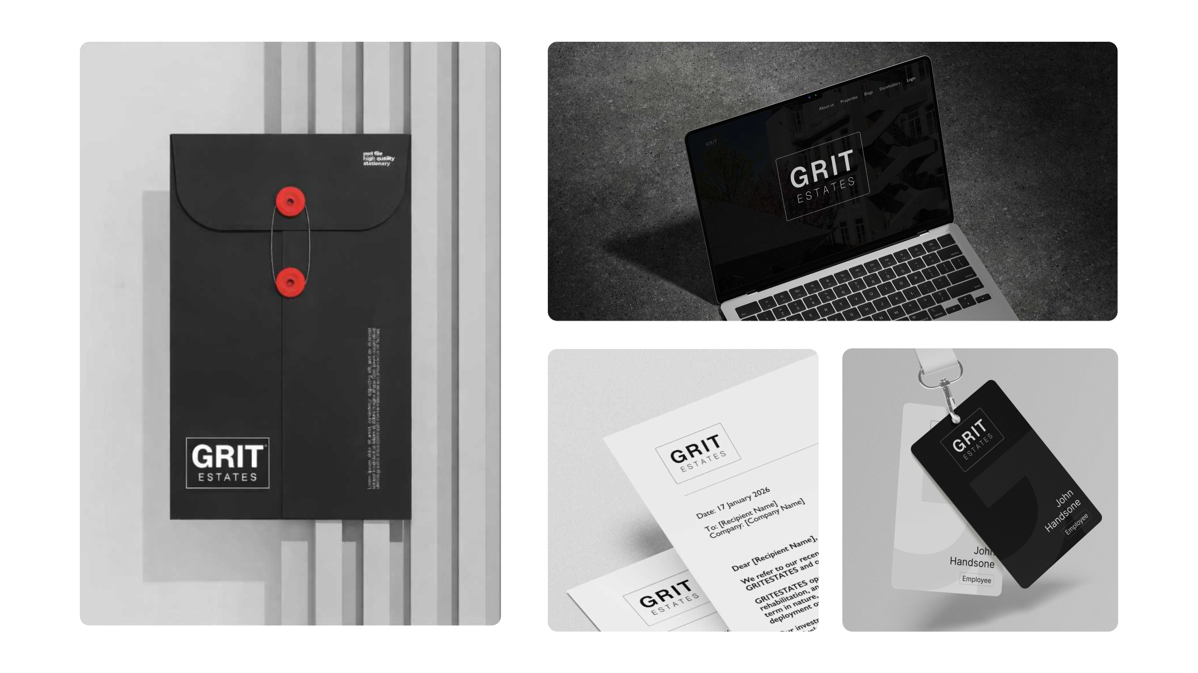
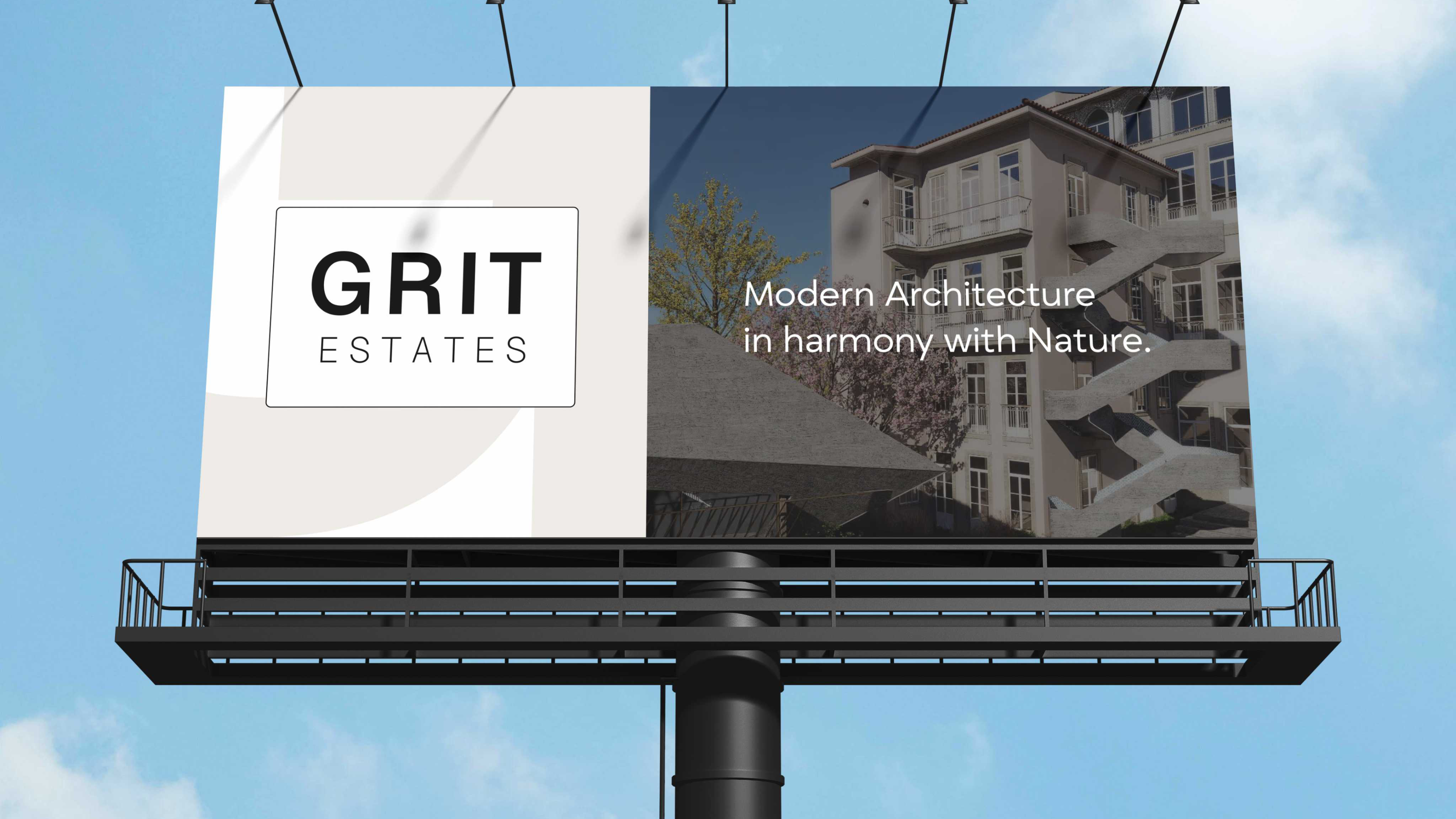
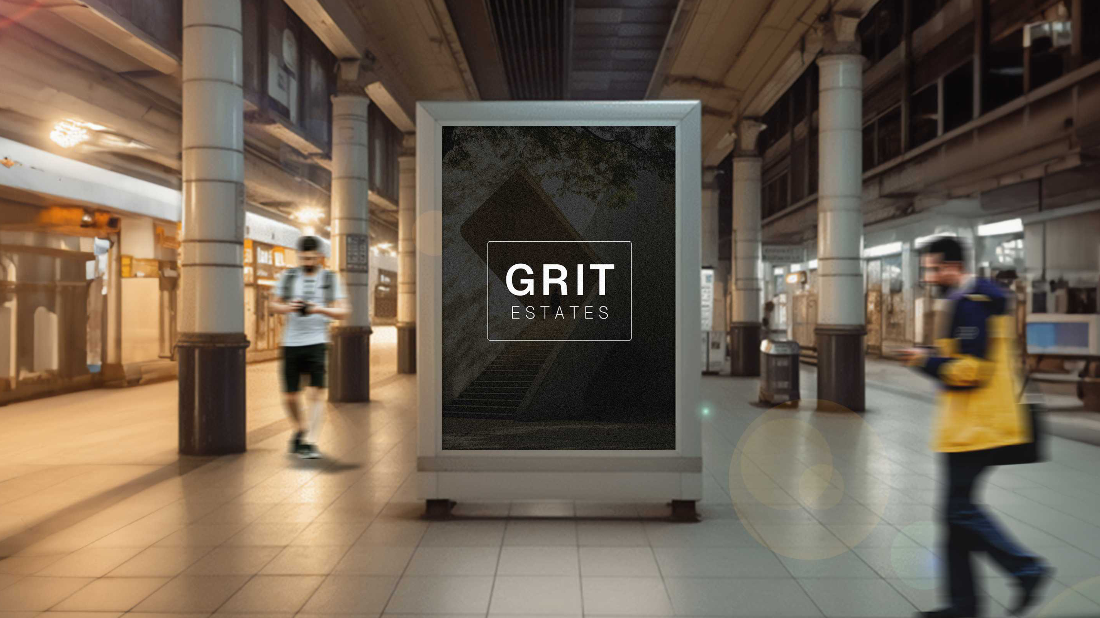
One coherent system: mark, palette, type, and a live website, giving GritEstates a credible, institutional presence from day one, ready to scale across every project and surface.